Pros:
Good screen
GPS included
Performs smoothly
Cons:
Disappointing design
Non-standard strap
Awkward charging port
First impressions can easily fool people and that is exactly the case with Sony SmartWatch 3. Unlike Moto 360 and LG G Watch R are getting a rush of popularity because of their circular design, sorry, but most people prefer their watches to be round rather than square-ish, (secret * I prefer a square-ish watch*), Sony has opted for an “old school” rectangular shape.
But while we may have expected a bit more stylish design, what is inside the watch and how it performs have blown our minds in a good way. You should probably check out it’s little sister the Sony SmartBand Talk while you at it.
It isn’t a cheap watch though, but at $250 it’s a damn good investment if you want a wearable that can pull double duty as both a smart-watch and a sports watch.
Interface
One of the most surprising things about SmartWatch 3 is that Sony has ditched its own operating system (which was very flawed to begin with) and instead put Android Wear in this watch. This is a welcome change, especially if you tried SmartWatch 1 and SmartWatch 2.
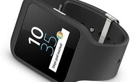
The clock face will be dimly shown all the time, so if you don’t want to see it, you have to go to the settings ad de-select the always-on option. If you want to light it up, all you have to do is raise your wrist or tap on the screen once. Should you want to dim it again, either wait a few seconds or place your hand over the screen.
If you say ‘Ok, Google’, you will get a new screen via which you can make notes or send messages. You can open this screen by tapping on the clock face as well, but where’s the fun in that if you can issue a voice command? Anyway, this option works really well, even if it’s loud around you, still expect the usual misunderstanding from time to time like every other voice command in existence.
On the main menu, you can swipe with your finger up, which scrolls though the available information cards. This will display things like weather and traffic. Swipe the screen left across a card and you’ll get more options about them. To delete them, just swipe right. If you didn’t want to, swipe down.
Swiping down from the clock face will open a few power saving options such as mute and ‘cinema mode’. This last thing will shut the screen off, unless you hit the power button again. You can also check the battery status while you’re on this screen.
There’s a lot more that you can do with Sony SmartWatch 3 interface, but it’s not always 100% clear how things work here. Still, you’ll get the gist of it pretty soon.
Performance is where this watch really shines in our opinion. This isn’t much of a shock considering it packs a 1.2GHz quad-core and 512MB of RAM memory. The only instance when it lags a bit is when you issue a voice command.
Display
At 1.6 inches, Sony SmartWatch 3 is a bit on the big side. However, this isn’t a bad thing at all. As a matter of fact, while most watches with a display this big will get you a poor resolution, Sony’s 320 x 320 is as good as you can expect from a company with such a reputation.
Reading the screen was no problem at all, even in direct sunlight thanks, for the most part, to SmartWatch 3 having a ‘transflective’ display. This is basically and LCD display that both transmits and reflects light. Hence, ‘transflective’, Duh!!.
The clock face will be dimly shown all the time, so if you don’t want to see it, you have to go to the settings and de-select the always-on option. If you want to light it up, all you have to do is raise your wrist or tap on the screen once. Should you want to dim it again, either wait a few seconds or place your hand over the screen.
Overall, the display on this watch is pretty good. It gives out a good brightness and has a solid resolution. It may not be an eye candy to some with its rectangular shape, but at least it is compatible with the majority of apps today.
Design
In our opinion, Sony SmartWatch 3 smart-watch could improve on the design department. It’s not so much about the square face, but the whole design.
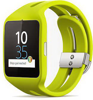
SmartWatch 3 looks a lot more like a sports watch than an actual smart-watch, which drastically reduces its appeal to some.
The standard rubber wrist band also looks a bit cheap and it attracts a lot of dust. Well, at least it’s comfortable, even if it looks like a sports watch, especially the yellow version.
The good thing about the band is that it is adjustable, so it fits on almost any wrist. In addition to that, the clasp is easy to take off and on. However, this also means the clasp can come off if you bend the wrist just enough.
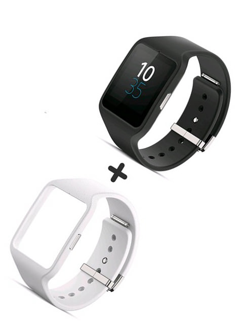
Changing the band is quite easy, and can be done without any tools. Unfortunately, this also means SmartWatch 3 does not support standard straps. Sorry, you will have to buy a Sony watch strap for this one.
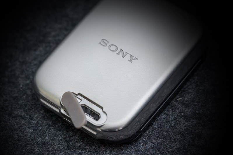
The body itself is pretty large, considering a 1.6 inch screen and assorted bezels. Surprisingly enough, the watch itself is not at all heavy. Another thing worth mentioning about the body is that it’s not adorned with buttons as with many other TechWear watches. Instead, there is only the micro USB port on the back (which includes an anti-water and dust cover).
Charging the phone is a bit tricky because of the placement of the micro USB port and the way the strap gets in the way. You will have to either remove the body from the strap or find some way to get to the port with the strap still on.
Apps
Sony SmartWatch 3 is mostly fitness-focused, with only a few apps available for it right now. Accessing the apps on the watch is done in one of two ways. The first is giving a voice command to launch the app and the second one is to find the app somewhere in the start screen.
Initially ,the Sony SmartWatch 3 will be pretty basic when you buy it, at least when it comes to apps on it. This is most evident when you are trying to navigate the map. You can find your address easily, but you will not be able to scroll the map itself.
Playing music on this watch is also a bit tricky, as the only way to listen to your songs is to upload it to Play Music and then listen from your phone. Unfortunately, this phone seems to think that it should sync all of your offline songs, instead of allowing you to select which ones you want to hear.
As a handy feature on this watch, you can get notifications for all apps you have installed. This works even if you can’t respond to them right away.
Battery
Most smart-watches have a problem with how long their battery lasts. Sony hasn’t made this issue completely go away, but its 420mAH battery will be able to run this watch for about two days without charging it, based on use of course.
Of course, there are watches that can work longer than that, like the Pebble, but this is still okay. The main problem, as I have already addressed, is the placement of the micro USB port. For a device you need to charge every 2-3 days, if not more frequently.
Verdict
Sony SmartWatch 3 is definitely not a watch for fashion oriented. However, if you are looking for a wearable that works better than almost anything else you can find on the market right now, the SmartWatch 3 is the perfect choice for you.


